
The dashboard below was developed through Elastic open source software using the Seoul metro passenger flow data in 2014.
Data visualization has been important in democratizing data and analytics and making data-driven insights available to workers throughout an organization. Data visualization also plays an important role in big data and advanced analytics projects. As a transportation field accumulated massive troves of data during the early years of the big data trend, they needed a way to quickly and easily get an overview of their data. Visualization tools were a natural fit.
Visualization is central to advanced analytics for similar reasons. When advanced predictive analytics or machine learning algorithms are available, it becomes important to visualize the outputs to monitor results and ensure that models are performing as intended. This is because visualizations of complex algorithms are generally easier to interpret than numerical outputs.
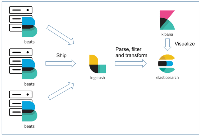
In TUPA, we utilized one of the strongest searching engines called Elasticsearch to make this visualization works. The flowchart below shows the process to deal with big data and visualize it.
For more detailed information please contact our TUPA members below;
Xu Yanping, [email protected]
Cheng Lyu, [email protected]
Comments are closed.